
Signs Your Logo is Outdated
There is a common misconception that a company or brand needs to keep its identity the same forever—that changing the logo would have negative consequences. However what we know is that maintaining the status quo too long can do more harm. You only need to look at major global brands as evidence keeping your logo fresh and relevant is vital.
Bad logos are often too bright, too loud, or too confusing. They simply don't make sense and don't fit with the quality of the brand. The biggest mistake I see is over-complication and merging ideas together that just don't fit. Take a look at some of the logos used as examples in this article.
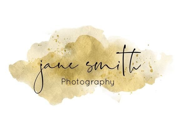
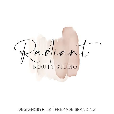
Water Colours
A water colour logo can be great if your brand is artsy or creative, but it is overused and usually not recommended. A splashy palette of colours surrounding a font is just too cliché these days.
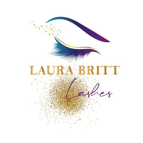
Gradient and Metallic Logos
Gradient and metallic logos may have once been eye-catching, but they now often signal an outdated brand. These effects, popular in the 2000s, can feel overused and don't always translate well across digital platforms. Metallic elements especially rely on high-resolution formats to capture their shine, which can be lost on smaller screens, leading to an inconsistent look. In today's digital landscape, simpler, flatter designs are preferred because they're timeless and adaptable—qualities essential for modern branding.


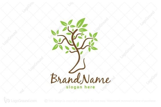
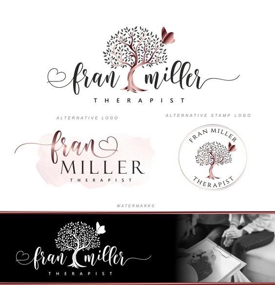
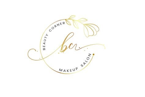
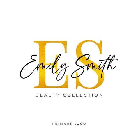
Initials with Script Name Overlay
Logos that feature bold initials with a script name overlay might have felt elegant and custom in past decades, but today they can feel generic and overly formal. This style is often associated with traditional businesses and lacks the clean, modern look that resonates with today’s audiences. The contrast between blocky initials and script text can also create visual clutter, making it hard to read and less adaptable across digital and printed formats. Modern branding leans toward simplicity and clarity, so swapping this look for a fresher, streamlined design can help convey a contemporary, forward-thinking brand identity.


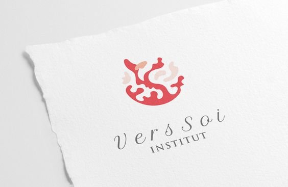
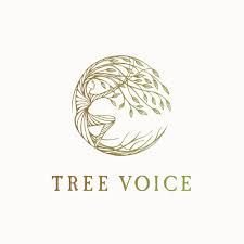
Overly Artistic Logos
Logos that lean heavily into detailed illustrations or abstract art might look beautiful, but they often miss the mark as a business and marketing tool. A logo should be more than just an artistic expression—it’s a key component of your brand’s communication strategy. When a logo is too complex or artistic, it can obscure your brand’s message, make the logo hard to recognize at a glance, and even become difficult to reproduce consistently across different platforms. A strategic logo, by contrast, is clean, versatile, and designed with purpose, helping clients understand who you are and what you offer in an instant.


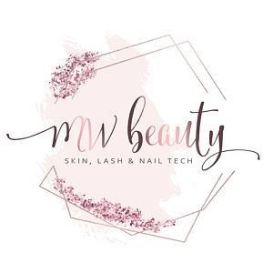
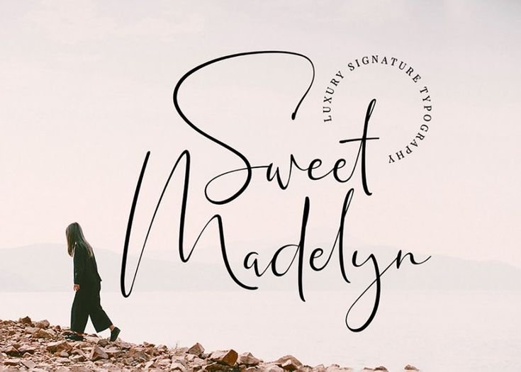
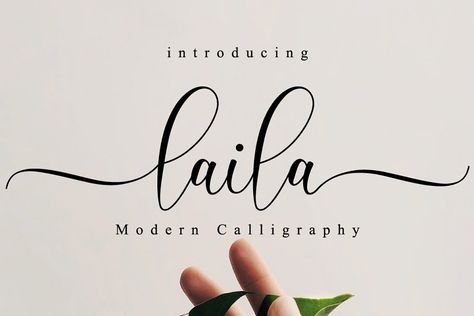
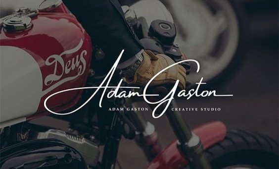
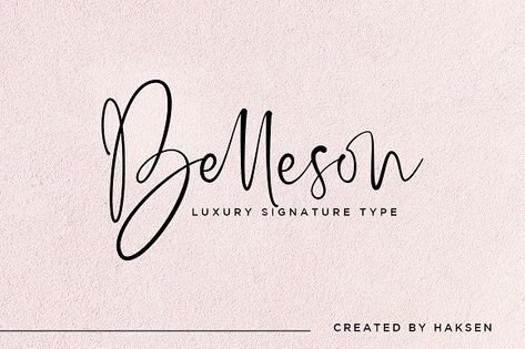
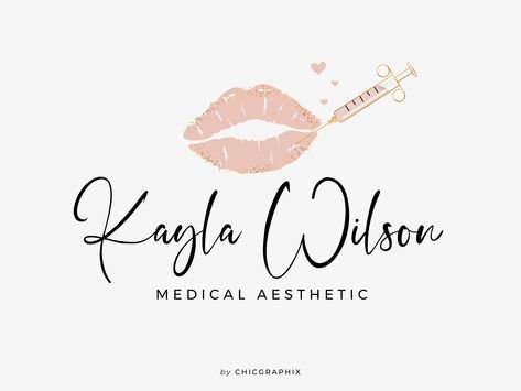
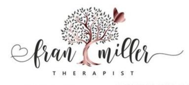
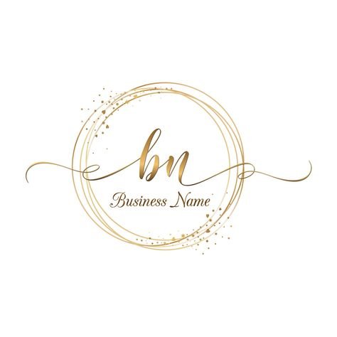
Overuse of Cursive Text
While cursive fonts can be used effectively in logos, especially when used sparingly or in combination with other elements, their overuse can lead to design issues and hinder the logo's effectiveness in representing a brand. Striking the right balance between creativity and legibility is crucial for creating a successful and impactful logo design.
Outdated Techniques
A common problem with bad logo designs is that they’re using outdated techniques, visuals and effects. The logos below look like they have been created decades ago—and not in a good way. Back in the 1980s and 90s effects like old-fashioned skeuomorphism, 3D gradients, clip art and certain fonts where used excessively, which now makes these logos look particularly dated.
While some brands may aim to tap into nostalgia with retro designs, it's crucial to ensure that your logo reflects the innovative and forward-thinking aspects of your business. Using outdated techniques not only makes your logo seem like a relic from the past but also risks signaling that your brand is stuck there, too.

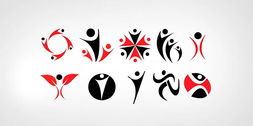
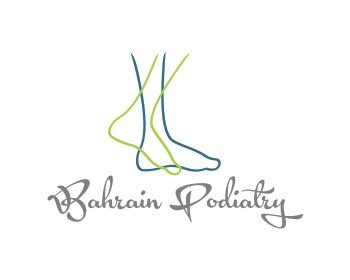
The V-Guy
This is the V-shaped abstract of a human figure you might have come across mostly in logos for social working organizations or any other service providing companies and while this shape can be adjusted into various forms it is such a been-there-done-that design that it has surpassed its expiry date and should truly no longer be included in your design portfolio.
The 'V-Guy' has been used so extensively that it no longer sets your brand apart. In a saturated market, differentiation is key, and this abstract figure is simply no longer a fresh or engaging visual.
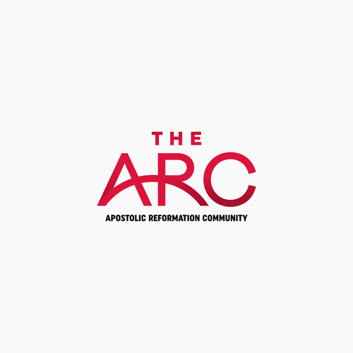
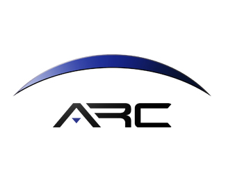
The Arc
An arc at the top, an arc at the bottom, an arc all around, an arc cutting through, we’ve had just about enough arcs already.
Sure it’s a great design.
An arc represents security, forward motion, rising above the competition, flexibility and a lot of other great things.
However, once again, you have got to give up on this idea, just because it’s too overused and common logo design cliches.
Sure Amazon added a new dimension to the arc by turning it into an arrow that goes from the A to the Z in their name, signifying that they’ve got everything you need.
While arcs convey positive messages, their overuse means they've lost much of their impact. Instead, consider exploring other symbols that represent growth or innovation in a more unexpected way. Or, use the arc in a more innovative manner like Amazon did with their arrow, giving it a fresh interpretation.
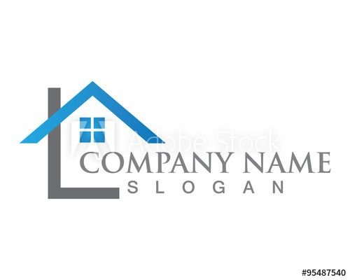
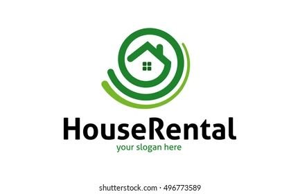
Industry Specific Logo Design Cliches
Almost every other realtor, property dealer or construction company’s logo incorporates a house in some way.
Far too many automotive companies have stylized cars or wheels for their logo.
Too many doctors and hospitals incorporate a red cross in some way.
Most internet and software solution companies try to use a web or a netted globe.
Writing and press related companies try to use a pen in their logo design.
Try to step out of the comfort zone of these industry-specific logo design cliches and differentiate yourself by infusing new meaning in your logos.
Experiment, try new ideas, discard old drafts and start anew.
Do whatever it takes but rise above the crowd and do something radical. Be unconventional, be a rebel.


Designed by an Amateur
A professional business should look professional. New business owners often invest a lot of time and money in property and equipment, but do not often match it by investing suitably in their branding and logo.
Here are the most common reasons why many logos look amateurish and ultimately, “outdated” as soon as the leave the door
The business owner wanted to save money by designing the logo quickly themselves.
A friend or relative who claims to know a little about graphic design does it as a favour.
The wrong people are commissioned. (Local printers are not likely proficient in logo design.)
The business outsourced the job via one of several design competition websites, which are mostly populated by amateur designers.
The job was given to an online company that offers really cheap logos.
All of the above can result in disastrous outcomes. If your logo looks amateurish, then so will your business.
If your logo was designed on a budget or by someone inexperienced, it’s never too late to elevate it. A professional logo not only sets the tone for your brand but also communicates credibility and trust. Investing in a professional redesign can ensure your brand is presented with the level of care and quality it deserves.

Overly Designed / Too Busy
A logo that is too busy and overly designed can hinder a business's ability to effectively communicate its brand and connect with customers. It's often advisable to aim for a clean, simple, and memorable design that can be easily recognized across different mediums and sizes.
A simple logo is more versatile and memorable. Whether it’s on a billboard or a business card, a clean design can easily scale across different platforms while still maintaining impact. Overly complex logos lose clarity and make it harder for your audience to form a connection with your brand at a glance.
Improper Use of Metallics
Using metallic elements in branding can present several challenges. Firstly, they may compromise readability and visibility, especially in certain lighting conditions or against particular backgrounds. Additionally, achieving consistent metallic effects across various printing methods and materials can be difficult, potentially resulting in deviations from the intended brand identity. The cost of using metallic inks or foils can also be higher than standard printing methods, impacting production expenses. Finally, the interpretation of metallic colours can vary across cultures, potentially leading to miscommunication or unintended associations. Careful consideration is needed when incorporating metallics into a brand's visual identity to ensure they enhance rather than hinder brand messaging and recognition.
You Have Not Used Any Typography Created in the Last Ten Years
Designers should be curious by nature and aware of current trends. If you fit this mold, you are likely to have found at least a handful of nice typefaces in the last decadeYou’re either not experimenting enough (also known as being lazy) or you’re of the hyper-principled mold and would prefer that the type just carry the message, not speak it. The latter is fine, but I bet it will get old after a few years.
Conclusion
Your logo is the first handshake with potential clients—it shapes their perception of your business long before any words are exchanged. An outdated logo doesn’t just risk looking tired or out of touch; it can actually turn potential clients away, impacting your business’s bottom line. When a logo feels outdated, it signals to clients that the brand might not be innovating, trustworthy, or aligned with current market standards. This can create doubt, making clients hesitate or look to competitors who present a more polished, modern identity.
An updated, strategically designed logo shows that your business values quality and is ready to meet the needs of today’s market. It builds confidence, attracts your target audience, and reinforces brand loyalty—all of which contribute directly to revenue growth. Investing in a fresh, well-crafted logo isn’t just about aesthetics; it’s about positioning your business for ongoing success.