
Website Navigation Best Practices
Little things make a big difference. Your website navigation is a great example. The structure and labels of your navigation can have a huge impact on results. Here’s why:
Navigation affects traffic: how high you’ll rank, how much traffic you’ll get from search
Navigation affects conversions: how easy the site is to use, what percentage of visitors convert into leads and customers
The order of your website navigation is important
The number of items matters, but so does the order of those items. In website navigation, just like any list, items at the beginning and the end are most effective, because this is where attention and retention are highest. It’s called the serial position effect, and it combines to cognitive biases:
Primacy effect: Items at the beginning of a list are more easily remembered.
Recency effect: Items at the end of a list (or things that just happened) are more easily remembered.
For this reason, anything we put at the beginning or end of our navigation becomes more prominent. We should put those items that are most important to our business and our visitors in these places.
Always seek to put the things that are most important to visitors in the most visually prominent places. This aligns with the core principal of web design and content marketing.
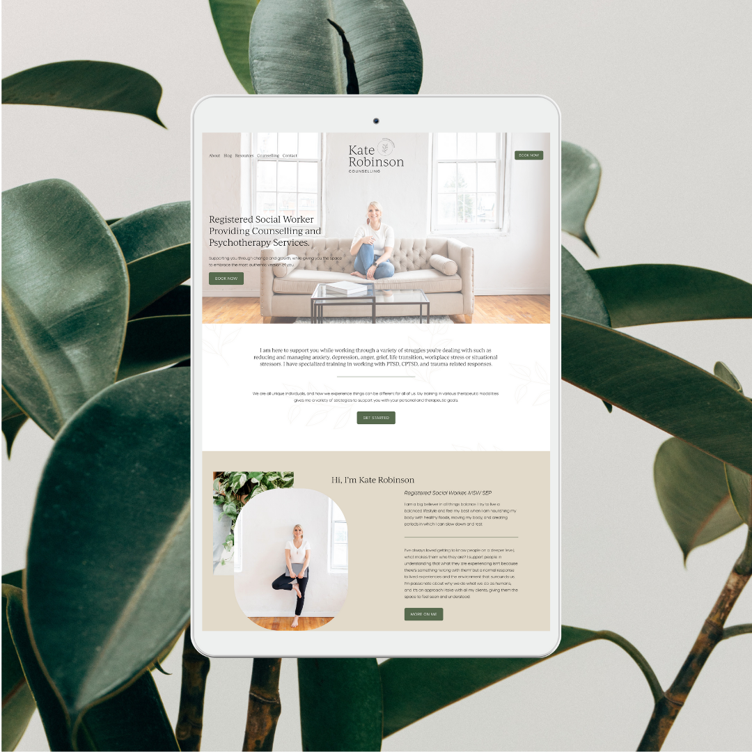
‘Contact’ should be the last item on the list, putting it at the far right in top-level horizontal navigation, a standard location.


Limit the number of menu items to seven
Some websites have hundreds of links on the home page. That’s bad. Limiting the number of links in your main navigation is good for two reasons.
Fewer items in your navigation are good for search engines
Your homepage has the most “authority” with search engines because more sites link to your homepage than to your interior pages. This authority flows down to deeper pages through your navigation.
Fewer items in your navigation are good for visitors
Short-term memory holds only seven items, plus or minus two. This is from the famous psychology paper published by George Miller in 1956.
More recent research shows that although the brain uses “chunking” as a method to improve recall in short-term memory, the number depends on the category. It may be seven for numbers, but only five for words.
Regardless, the more items in your navigation, the more difficult the information is to remember and process for your visitors. Visually, eight is a LOT more than seven. If you have too many, visitors’ eyes may scan past important items.
If you need to use more than seven items, consider breaking them up into groups.
Hamburger Navigation Menu on Desktop
The hamburger menu is most often seen in mobile web design. With this approach, the navigation items are often listed horizontally on larger screen sizes and collapse behind a hamburger button on smaller screen sizes. When visitors click on this three-line icon, a vertical drop-down or horizontal pop-out appears with the navigation links. This type of design is ideal for mobile apps or sites where real estate is limited.

Link Back to the Home Page with Your Logo
Something that many people overlook, is the simple act of linking your logo to your home page at the top of the page. This is a standard feature that enables users to always have access to their starting point. This requires a logo, something that the target audience will associate with your brand.
Avoid Social Media Icons in Navigation
Unless you are really trying to promote clicks off to your social media as the primary call-to-action, then it is best to keep them in the footer and not within the navigation. Otherwise, they will simply be distracting website users and disrupting your natural funnel and path you wish them to take on your site.
